Play
Deville Coffee Loyalty App
Pre-AI era project I'm still proud of. Designed and prototyped the old-fashioned way, manually setting up design systems, tokens, variables, and everything in between ;)
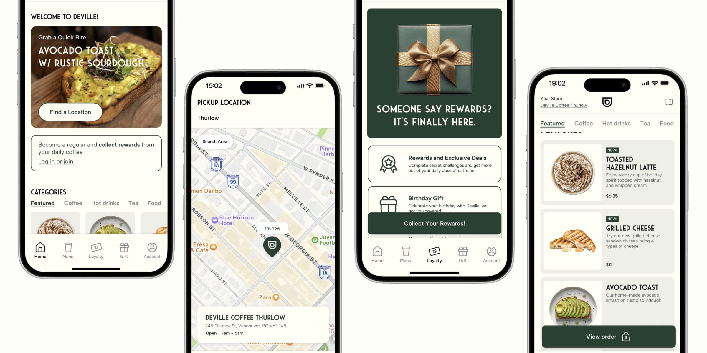
Deville Coffee is a Calgary franchise with 20+ locations and no app. I started there as a part-time barista, watched the same regulars order the same drink every morning, and designed the app they didn't have.
This is the short version, built around the prototyping. The full case study covers the research, the ideation and the testing that got me here.
- Positive user reception
- 100%
- Task success rate during user testing
- 97%
- Faster task completion than competitors
- 1.2×
Giving people an out
Placing an order is where most people hesitate. An out, a way to review or edit what you picked without losing your progress, is what turns that hesitation into a purchase.
It wasn't until I went back and changed the quantity to 1 or more that the item was added to my order
Quantity started at zero, so tapping Add to Bag added nothing. In V3 it starts at one: tap Add to Bag and one item is added, or if you set a quantity, that's what goes in.
Navigation, icons and messaging
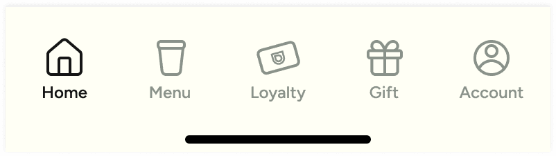
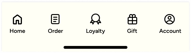
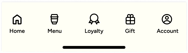
The Iconify set wasn't cutting it, so I drew a custom one to match the branding. The label mattered as much as the icon: people told me browsing a menu feels like less pressure than placing an order, and Menu became the most used page in the app.
What I took from it
Designing an app with no explicit guidelines, and no team to talk micro-interactions and edge cases through with, was the hard part. I leaned on design mentors, books and videos instead, and got a lot better at deciding on my own. If you have questions about this project, feel free to contact me.